
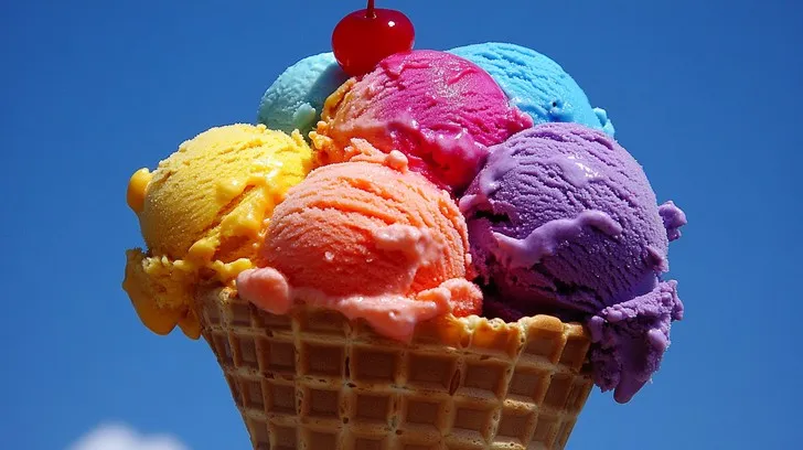
Ice cream colour does more work on the shelf than most people notice. A shopper decides within seconds whether a tub looks like strawberry, mint or vanilla bean, and that quick judgment shapes how the first spoonful tastes. The hue has to promise the flavor before the lid ever comes off, or both the first sale and the repeat purchase are at risk.
What the eye expects before the tongue does
Studies on flavor perception keep returning to one point: people taste what they expect to taste. A pink scoop reads as strawberry and a pale green one as mint. If the shade is off, the same recipe can seem weaker, or even strange, to a tasting panel that never saw the ingredient list. Perception is part of the product.
That puts pressure on every hue. Pistachio should lean toward a muted olive green, not bright lime. Vanilla bean needs a creamy warmth rather than stark white. Small shifts change the story the product tells, and a shade that feels artificial can make a premium recipe look like a budget one.
Air, cold and fat change what you see
Whipping air into the mix, known as overrun, lightens the color. A shade that looks deep in the liquid base can fade to a pastel once frozen. Judge trials on the hardened product, never on the mix alone, and take the sample at the same temperature your customers will see in the cabinet.
Fat plays a role too. Dairy fat scatters light and gives a soft opacity, so strong pigments look milder. When choosing food coloring for ice cream, expect to use a little more than you would in a clear drink, and always confirm the result after the scoop has softened slightly. Melted edges often reveal weak color first.
Matching sources to the flavor
Beetroot and black carrot give pinks and reds for berry flavors. Turmeric and annatto deliver creamy yellows for custard and butter pecan styles. Spirulina blue paired with a yellow source produces mint tones without synthetic dyes, which is a combination worth testing early because each pigment responds differently to the mix.
Brown shades for chocolate and coffee often come from cocoa or caramel-based colors. Each source behaves differently in a dairy base, with its own opacity and flavor risk, so test two or three options side by side and let a small tasting group compare them before anyone makes a final choice.
Process timing and heat
Pasteurization is the main hurdle. Some pigments, spirulina in particular, are sensitive to heat and acid, so they are normally added after the heat step, often at the flavoring stage just before freezing. Ask the supplier for the maximum temperature and hold time a pigment can take before it dulls.
Ripples and inclusions need their own plan. Fruit sauces are acidic and can shift the shade of anthocyanin colors. Check stability in the sauce first, then in the finished tub after several weeks in the freezer, because color migration between layers often appears only after some time has passed. Patience here prevents expensive surprises later.
Keeping the shade steady in storage
Freezer storage is kind to most pigments, yet display cabinets are another story. Strong lighting and temperature cycling can fade colors over time. Opaque or tinted packaging helps, and so does rotating stock quickly, since a tub that sits under a bright lamp for weeks will not look like the one that left the factory.
Run a shelf-life check that mimics real retail conditions. Open and close the cabinet, leave one tub under a lamp for a few days and compare it with a retained control. That simple routine catches fading problems long before a customer notices that the strawberry has turned pale. It costs very little and protects the whole range.
Color as Part of the Recipe
Frozen desserts live or die on first impressions. When color, flavor and process are planned together, the result looks as good as it tastes, from the first glance to the last scoop. Treating color as an afterthought is the quickest way to lose that harmony between what people see and what they taste. Good color supports good flavor, and the reverse is also true.
If you are building a new flavor line, foodrgb.com offers samples and technical guidance for plant-based colors in dairy applications, so you can test shade, dose and stability in your own mix before scaling up to a full production run.